Experience FLUID STRENGTH
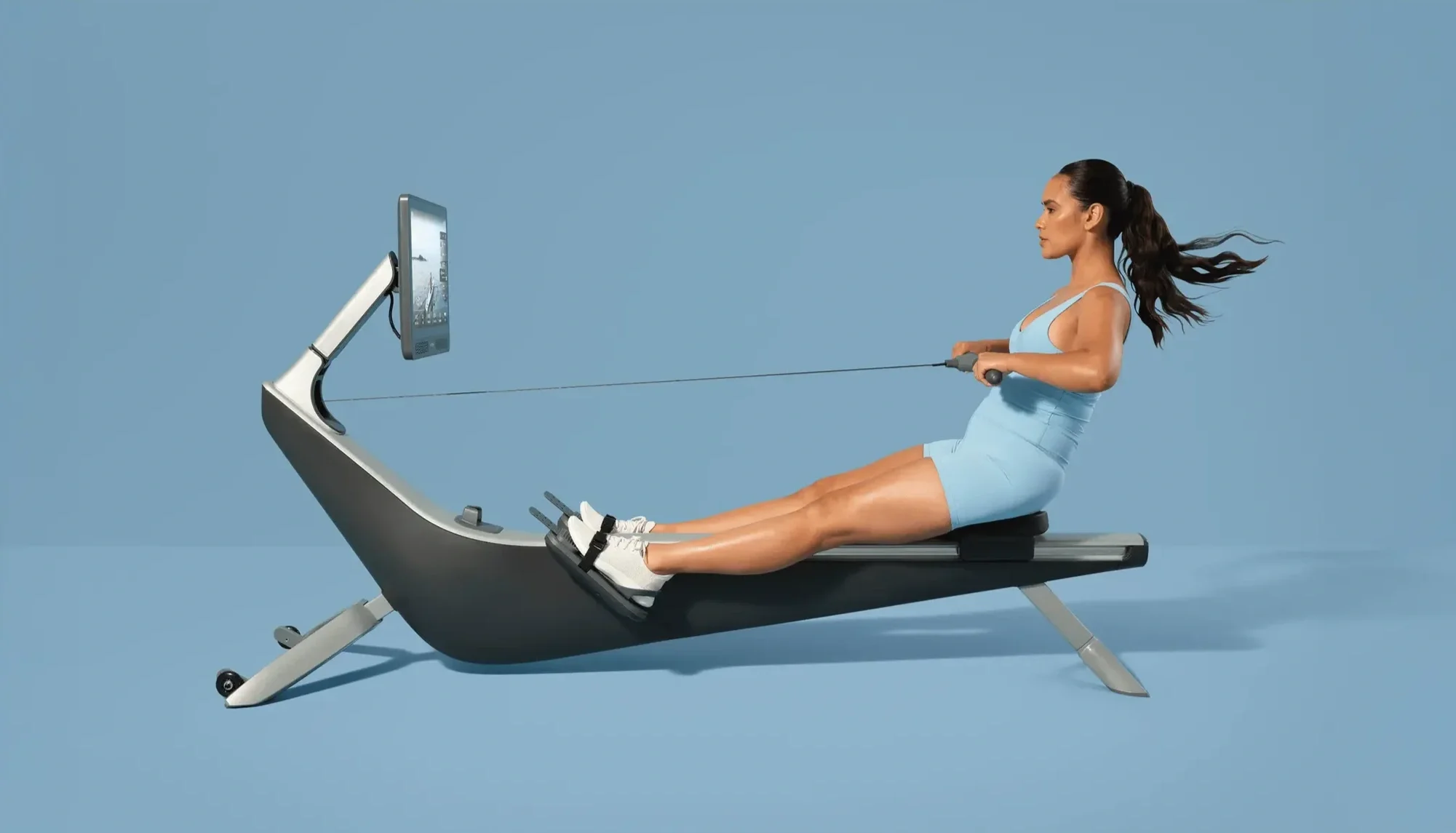
The most powerful form of strength is the one that moves with you. It’s responsive and intelligent, not rigid nor forced. From the start, Hydrow was built around a simple idea: that water holds more than resistance. It holds strength shaped by control, and maximizes effort through motion.
We call it Fluid Strength. It’s a new standard in fitness – full-body training grounded in form, designed to meet you where you are
Role: Graphic Design
Agency: keelbone
Strategy: John Swan +
Dick de Lange
Copy: Madison Duke
Fluid Strength
✳︎
Hydrow
✳︎
Fluid Strength
✳︎
Hydrow
✳︎
Fluid Strength ✳︎ Hydrow ✳︎ Fluid Strength ✳︎ Hydrow ✳︎
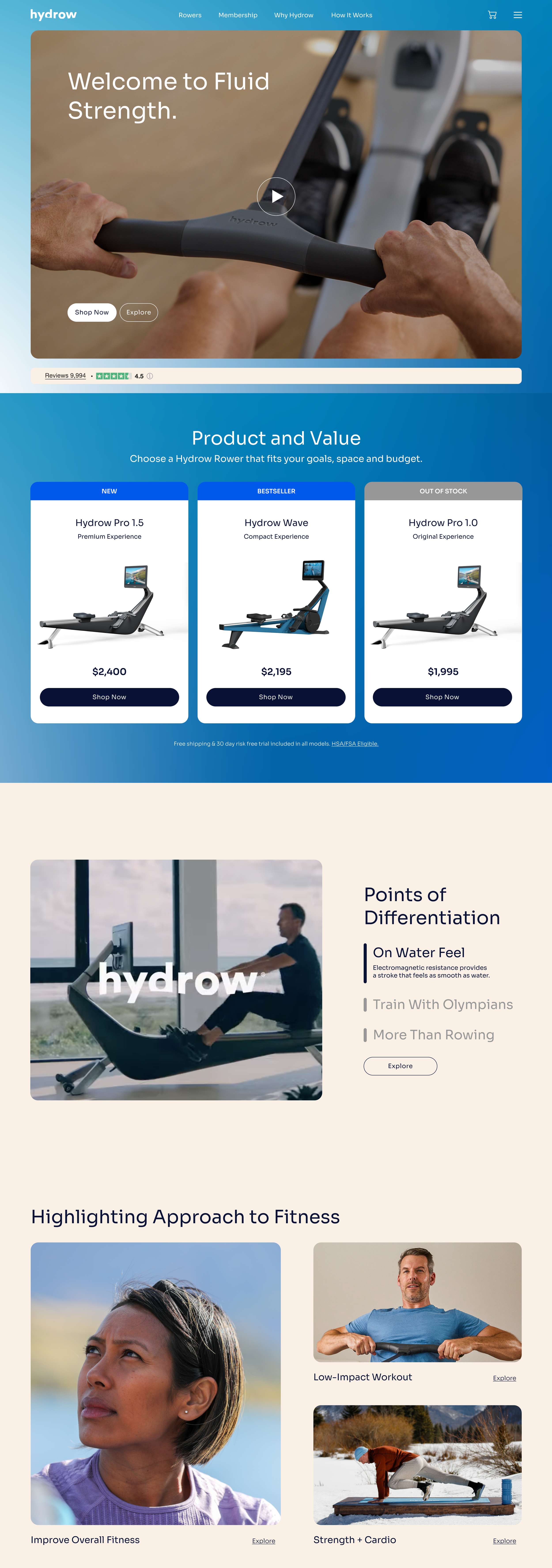
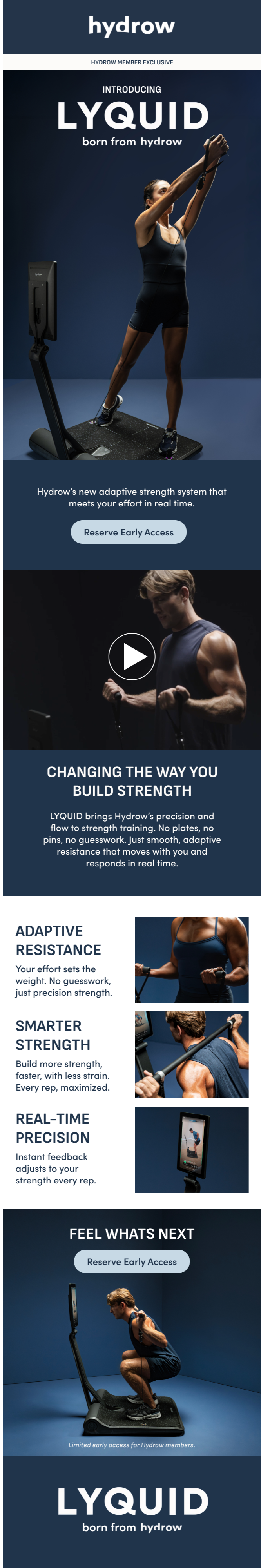
We introduced “Fluid Strength” as a new brand ethos, redefining the way the company shows up in the market. While the previous brand identity centered heavily on results and performance metrics, we shifted the focus to the holistic, full-body experience of rowing — highlighting its rhythm, motion, and flow.
Beyond performance outcomes, we wanted to showcase rowing as an accessible, powerful workout for a wide range of people: competitive athletes looking to cross-train, busy parents seeking an efficient full-body session, and individuals simply wanting to get in shape. By broadening the narrative, we positioned rowing not just as a results-driven tool, but as a versatile, inclusive fitness experience.
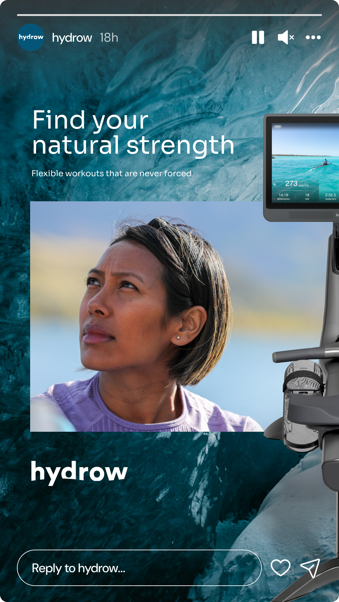
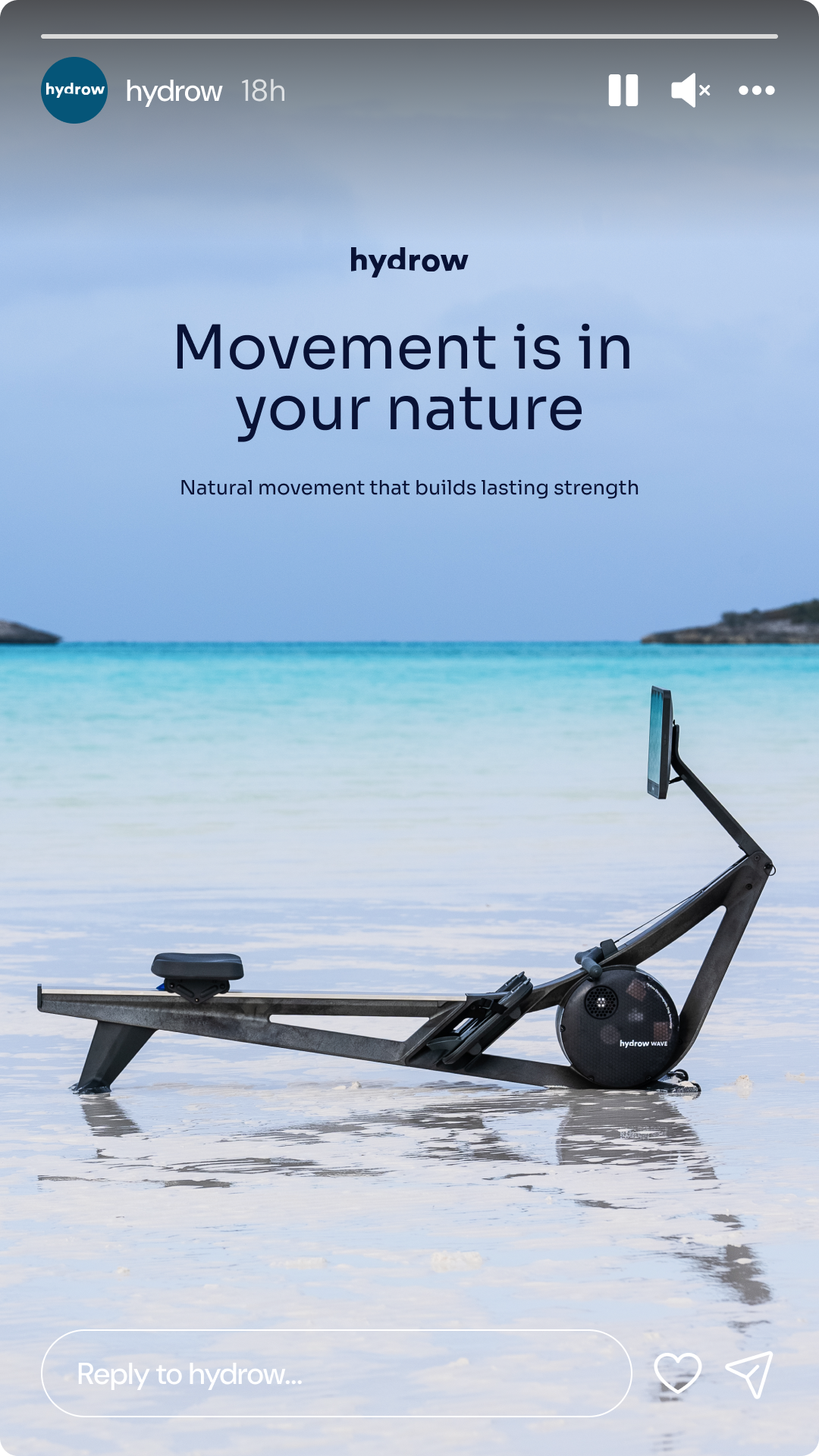
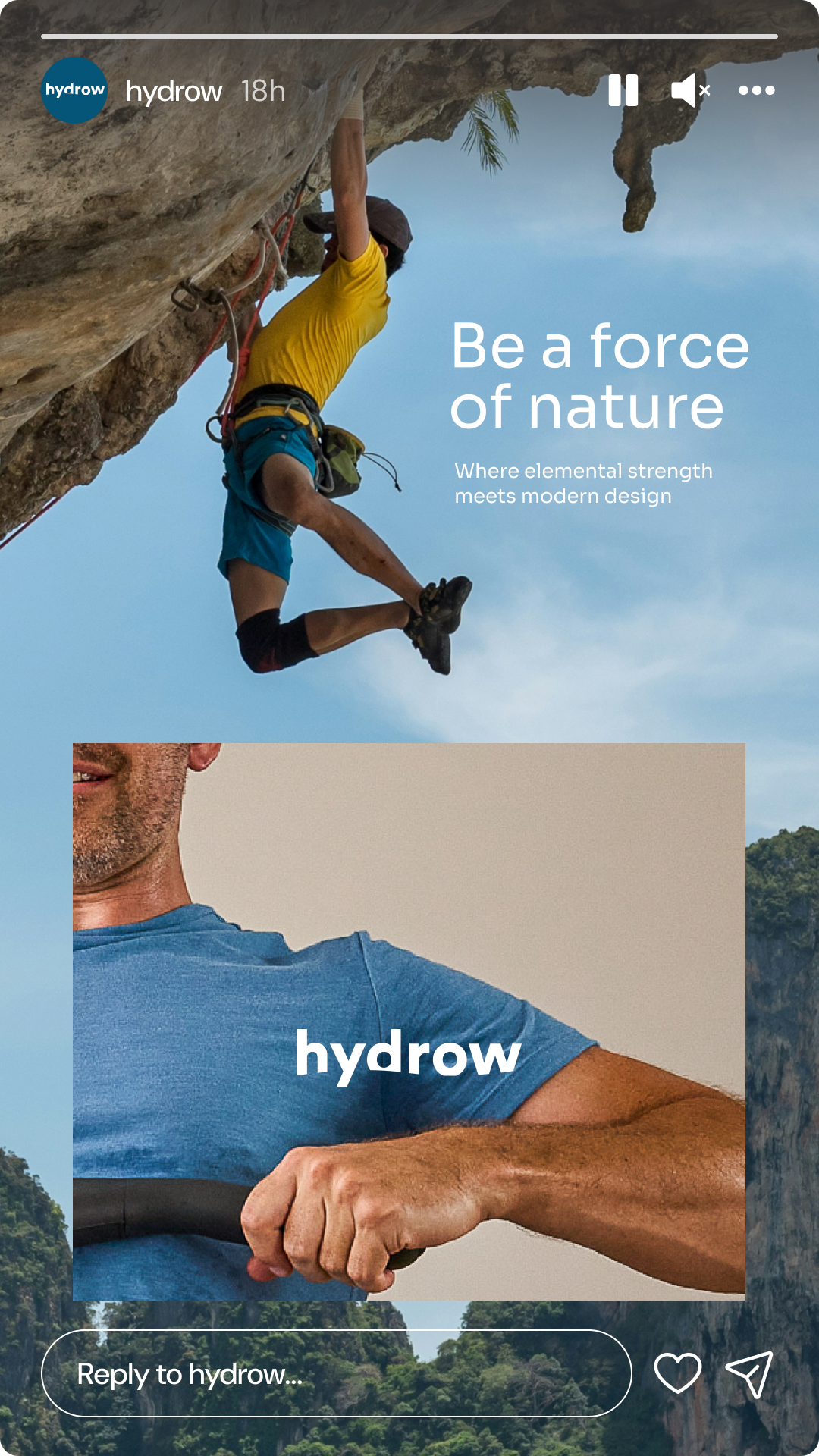
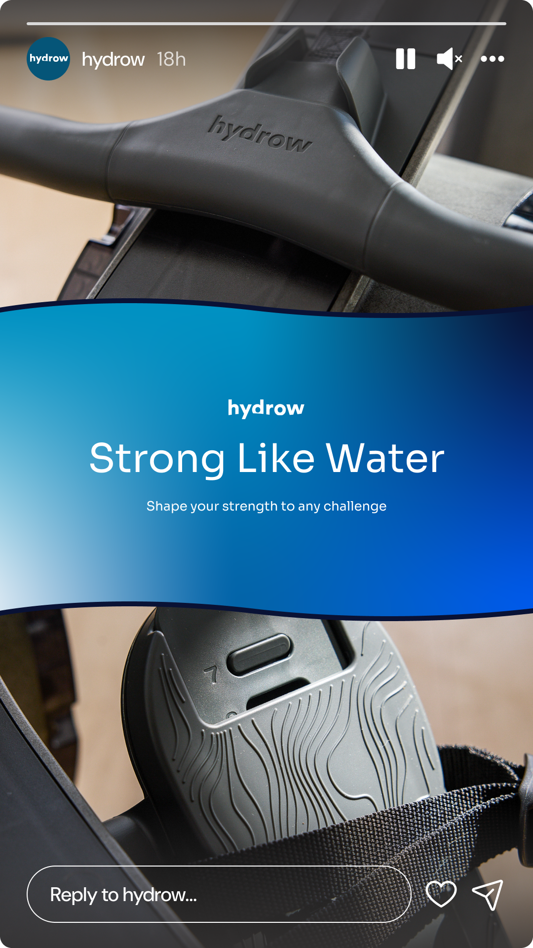
By leaning into the fluid nature of the movement itself, we unlocked new audience segments and repositioned the brand as both powerful and immersive. Visually, the refresh embraced fluid gradients across layered shades of blue, a modernized typeface, and dynamic, unexpected crops that showcase how people truly engage with the machines.
We brought the refreshed identity to life across key touchpoints, including a redesigned website landing page, a suite of social content, and a targeted email launch campaign supporting their new strength product. The result is a cohesive brand experience that feels as fluid and strong as the workout it delivers.